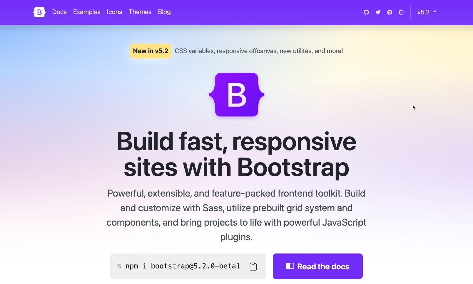
What's New in Bootstrap 5.2
Bootstrap is still one of the most popular frameworks on the web and it released a really interesting update with 5.2, so let's take a look at what's new in this release.
One of the most popular frameworks on the web has been falling recently in terms of popularity. I don't think it's Bootstrap's fault, I still love to use it, but I'm no longer using it for everything.
Today, I spend more time on libraries like Tailwind CSS and in lots of episodes of The Toolbox, I've been exploring more interesting frameworks like Pico CSS, Open Props and Assembler CSS
But there's something about Bootstrap that makes it compelling. It's the easiest way to get started with a robust set of tools that offer most of what you need to create simple sites. Setup is minimal, and it's a great starter kit for projects.
I'm always interested when there are new versions of the framework, but 5.2 is a bit extra interesting. For one, it was released as a beta...which is unheard of for a minor revision. Let's dig in.
Redesigned Documentation

The first thing you'll notice about this new version is that the whole site has been redesigned from scratch. It still has a bit of a Bootstrap classic flair, but if you look closely, you'll notice that the purple is a bit brighter than usual. I always thought it was weird that although the purple isn't really part of the color utilities, it still appears as an option in the variables and is the color used for the site.
Another very slight change is that the edges are a bit rounder and some of them are also a bit darker. Very minor changes you probably won't even notice, but it does make it feel a bit more modern.
Variables
The really big change is the addition of configuration variables for a lot of the built in components.
This is why the update is considered to be huge, although other than this, there's not that much that you'd consider actual new features.
I can see that making a large number of variables for tons of the components would take a long time. This also prepares them for a new feature called dark mode. Coming soon on version 5.3.
Text Background Helpers
Another new change is the addition of a .text.bg.* helpers. These will automatically set a background color and at the same time set up a reasonable foreground color. With previous versions you could use the .bg-* classes, but then the fonts wouldn't have enough contrast, so you'd also have to set up new .text-* classes.
This is a shortcut, but you can still use the old classes if you want to further customize the colors of your foreground text.
Responsive OffCanvas
The OffCanvas component, which slides content in and out of the sides of your screen now has a few responsive variations, so that you can trigger it only at certain sizes with .offcanvas-{sm|md|lg|xl|xxl}.
Thicker Table Dividers
There is a change to table dividers so that the thicker borders are now part of an optional class you can use.
Scrollspy
A welcome change to scrollspy is that it was re-written t use the Intersection Observer API. This is a JavaScript API that makes it easier to do things based on when items appear on screen. That means you don't need relative parent wrappers and you no longer need the offset configuration.
Forms
A simple addition of a new .form-check-reverse classs means that you can now flip the order of labels and checkboxes or radio buttons. This is a minimal change, but it's about time.
Tables
In addition to the traditional striped rows, you can now use a .table-striped-columns class to do the same thing to column. I can see that I'd ever use that, but it's a nice option.
Conclusion
I thought this was a decent upgrade and the addition of variables is great, however, because they're CSS variables, they're not as powerful as what's available with SASS, so their advantages are limited. I can't, for example just change the primary color in one place, but need to reassign it everywhere I want to use it.
I think it's a solid update, and honestly, I can't wait until the next version offering dark mode. I love Bootstrap, but it's definitely showing it's age and worse, NOT moving to PostCSS was a mistake, but the platform moves forward.