The Coolest Bootstrap 5.1 Features-Ep06
In this episode of the toolbox, we're going to talk about some of the coolest features in bootstrap 5.1, like support for offCanvas in navbars, placeholders and stacks. In Toolbox Shorts we've got an amazing search engine for developers and a big change on how Google indexes titles. Plus demos of how to streamline your querySelectors and what's quite possibly the next big thing in CSS development. It's Wednesday, September 8, 1pm Eastern time...and this is episode 06. So, let's get tooling
Hello everyone this is Ray Villalobos and I stream about front-end and full stack tools Wednesdays at 1pm Eastern time 10am Pacific. So follow me and subscribe on the social media things for tons more content. If you want to watch any past episodes, make sure you take a look at my blog...raybo.org.
Toolbox Shorts
Let's get started with some shorts. These are cool new tools information about what's going on.
Sourcegraph
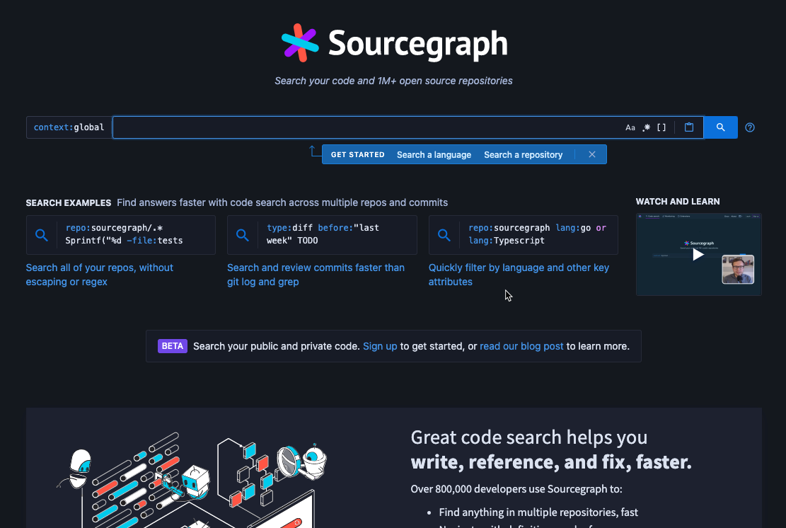
Ah developers...where would be be without sites like Stack Overflow or Google. Well, we'd be looking for a search engine like Sourcegraph. It's designed specifically for developers, so you can do regular expressions searches or filter by language...looking for a repo, it does that too.
Google Search Engine Titles
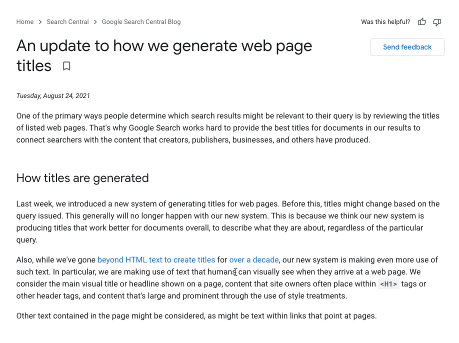
Okay, guilty as charged...I tend to load up my page titles with keywords just like anyone else...ok? But, it looks like Google noticed and is updating the way that they generate search titles. They are still taking into account page titles, but now uses genius unicorn magic to show a title based on the content of the page.
Stream Deck Key Creator
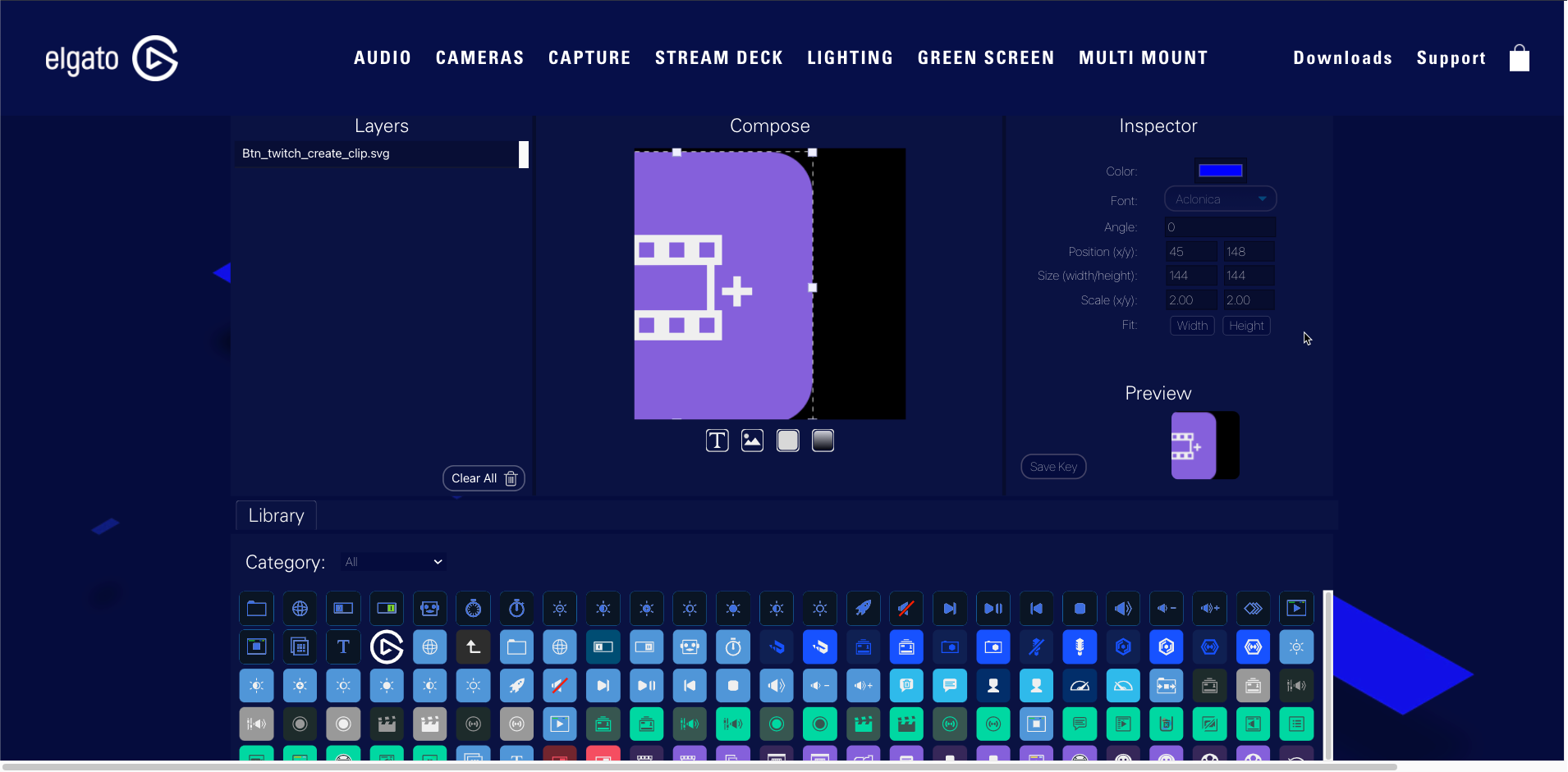
I didn't even know this was a thing until I started using my Stream Deck. Still though, it should work for other icons that you need for your mac or anything else. It offers layers and lets you import your own images as well.
Smartcrop.js
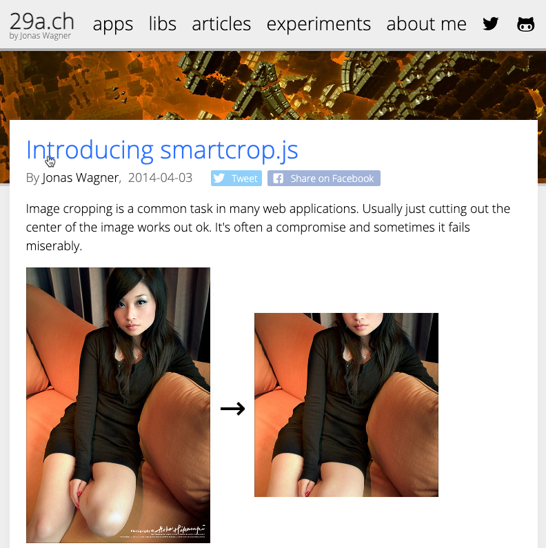
A bit in the early stages, but it looks promising. This project analyzes an image and crops it to the smallest possible size that still makes sense. Could come in handy for some projects.
Q&A
Demos
Bootstrap 5.1 New Features
Let's talk about some of the new features in Bootstrap 5.1. The big things in Bootstrap 5 were the switch over to javascript from jQuery and RTL or Right to Left support. But there wasn't really that much else happening other than maybe offCanvas support...which is pretty cool Bootstrap 5 adds
Accordions
One way to condense a lot of data in a small space is through the use of accordions. It's probably one of the hardest components to get working because there are so many classes to add.
Accordions have a main container class that needs an ID to identify it on the page
Inside accordions, you add an accordion-item class for each item that you want to be a part of the accordion.
Inside the items, you can include an accordion-header and an accordion-collapse container classes. Each of these should have an individual ID, so they can be targeted for opening or closing.
Inside the accordion-header, you will create a button with a class of accordion button. It's job is to open or close one of the items.
data-bs-toggle="collapse" - To make sure the javascript knows what this button does.
data-bs-target="ID" - the target element you wan to show or hide. This is the one with the accordion-collapse class.
aria-expanded="true" - If the element is showing, add this.
aria-controls="ID" - For assistive devices, identify the id of the element that gets controlled.
There is another option called accordion flush that will get rid of some of the colors and borders...that might be better for inserting in something like a list group.
OffCanvas Components
The OffCanvas component lets you build sidebars into your current project. In version 5.1 it gets an additional superpower, which is the ability to work in navbars.
There are two parts of the Offcanvas container: the offcanvas trigger as well as the offcanvas content. Let's start with the trigger, which shows or hides the content.
OffCanvas Trigger
The trigger can be either a button or an anchor tag. If you're using a link, you can simply add an href with the ID of the target, or you can a button an include a data-bs-target attribute with the ID or any CSS selector.
Although you can trigger these with JavaScript. Adding a data-bs-toggle with the value of offcanvas will initialize the component as well.
OffCanvas Content
This is the thing that you want to show. The main container uses an offcanvas class.
The component will be hidden by default, but you can add the show class to have it show the component when the page is loaded.
You can control the position of the offcanvas with the offcanvas-POS class. The component will take the full width or height of one of the sides, so this lets you control where it appears.
There are some classes for the content inside, so you can have a header, title and body. It's also common to see a close button in the header that lets users close the component.
By default, when the component is showing, the background will have a dark overlay and not scroll, but you can control that with the data-bs-scroll and data-bs-backdrop attributes.
Notes:
offcanvas-POS: start, end, top, bottomdata-bs-scroll="true"data-bs-backdrop="false"
OffCanvas Navbars
OffCanvas in Navbars
There is new option in 5.1 for the offcanvas component. You can use it inside a navbar component and it creates an interesting look for the navigation.
If you already have a navbar, the key is to change the data-bs-toggle property and change it from collapse to offcanvas. The button that usually toggles the navbar-collapse will point to the Offcanvas component instead.
You also need to add a tabindex="-1" to the offcanvas component and if you're using a header, which you really should so that it can have a close button, you should also have a aria-labelledby property with an ID of the header.
Other than that, the navbar-nav part of your navigation goes inside the offcanvas-body
Placeholders
Placeholders let you substitute boxes instead of actual content on a page, so you can use this if you don't have text for a layout you're creating.
To use it you start by adding a placeholder class to text or button elements you want to be rendered as boxes. You should add a column width from 1-12 to specify the width of the container. The width will depend on the width available to the parent and because they're columns they will automatically appear side by side. You can add a d-block if you want it go to a next line.
If you type some content within the placeholder component, it will grow and shrink with the content. The size of the boxes will be controlled by the type of element, so an H1 would show up bigger than an h4.
You can also just specify some different sized heights by adding a placeholder class with a size parameter. Notice there's no medium because that's the default size without a size value.
You can also specify that a placeholder animate in one of two ways. Wave moves from side to size and glow sort of pulses the color
If you add the placeholder to a button component, you need to set it to disabled and the aria-hidden value to true.
Stacks
Stacks are new helpers that to help you create quick Flexbox layouts.
There's two types of stacks, vertical and horizontal.
The v-stack creates elements that are full width by default, but you can use utilities like margin and gap in order to control how they look.
hstack is for horizontal layouts and you can use margin utilities to control their spacing.
There's also a really nice utility called vr that is just like a horizontal rule, but meant for quick vertical lines.
JSL Preview
Up next, let's take a look at a course I'm working on and I'll give you some tips on how to create shortcuts for querySelector and querySelectorAll so that they use the dollar sign variable...just like jQuery.
I've got a new series that I'm working on called JavaScript as a Second Language, and I wanted to give you a peek at how I'm writing these. So if you look at what's over here, it's a markdown file in a radio style format so that I can communicate with producers how I want this thing to be displayed. So I've created a Photoshop file that has all these different screenshots. As part of creating this project, I decided to create this little app, and I wanted to show you a trick that is a shortcut to query selector.
So here I am in my repo with a code example, and I'm going to switch over to the before branch, so I hit the period.
It's going to open up a codespaces with a codeswing already installed. And in here the app, of course, doesn't look quite as exciting as the previous app, but essentially every time you shear three sheep, it will add $10 using the modulus operator right here. Now, the interesting part that I wanted to show you is that I have all these document.querySelectors targeting different elements. So this one is targeting the button right here this button, and then these other ones are targeting the account and the total.
So sometimes the document.querySelector is a lot to type, and I really miss the way that in Jquery you could use the dollar sign variable, and you can recreate that by using the dollar sign as a variable in JavaScript.
This is weird, but the dollar sign is an actual valid variable name and JavaScript along with the underscore. And what I can do here is set document.querySelector and go ahead and bind that at the document level. So I'm binding this dollar sign as sort of an alias to querySelector, and if I wanted to, I can also do a double dollar sign and bind that to querySelectorAll. Now that means that wherever I'm using document.querySelector, I can instead use the dollar sign and then target the element just like with jQuery.
So this should work in exactly the same way, but it's a lot easier to read, especially on a document where you're using query selector.
Another thing that you can do with any GitHub repo is compare two of your branches, and this is pretty handy when you are creating a code demo, and all you have to do is switch the URL of the current repo and add the keyword compare at the end. Then you can compare the two branches by just naming them and separating them with two periods, and that gives you a diff of the two, which means that you can send somebody a difference between two branches, and this helps you give a better presentation, especially when you have to do something like live coding.
Q&A
Assembler CSS
Every once in I while, I find something that's a completely new idea and I think I may have just found the next great thing for web development.
This is a CSS framework that uses JavaScript to build your CSS quicker. In the same way that Tailwind CSS feels like the next version of Bootstrap for Component based sites. Assembler CSS feels like where Tailwind CSS should be going.
Let's take a look.
So let's say that I wanted to try this new library called Assembler CSS looks pretty interesting. So what I'm going to do is I'm going to start a new tab here. Just type in GitHub.dev, and start a new code swing. And here I'll do an HTML, CSS and JavaScript template.
I want to see the two web pages side by side. So if you're on a Mac, you're going to like this tip. I'm going to get out of full screen mode here and I'm going to split these different tabs into two windows. Then I can Hover over this little button right here and then tile this window to the right of the screen. I'm going to show them side by side like this, and then I'll just click on this one.
This is Mac's Split view. So let's go ahead and change this layout here. I'm going to pull up the command palette and then choose Change layout and I'm going to split this at the bottom. This will put all of these sort of code tabs here at the bottom. I don't need the script tag and that gives me a lot more real estate to see what I'm doing.
So let's take a look at the documentation to see what we need to do here to install this. I'm going to need this script call right here. So I'm going to copy this from this window, go into my code swing and choose Add library. This is going to be added as a script reference, and now I can take a look at the core concept section here. This library lets you take something that you would add into a style tag inside an element and express it in a different way.
So you can see here that we're doing exactly the same thing with an x-style attribute. Instead, let's go ahead and copy this code and just put it in where our HTML would go. You can see this square appear here. This might work better if our style section is at the bottom here. So let's just move that to the bottom.
That's not too impressive, but they have these additional virtual properties that are written in the same way as CSS classes and bootstrap and tail when CSS. So all that code right there you can write by simply using something like this and you get the same result. So the interesting thing is that you can also add CSS variables into your code. And to do that, you just create a root variable just like you would with a regular stylesheet. So let's go ahead and add this primary color right here.
And then you can use that as a variable in your content. So we can replace this background color here with our CSS variable and the shortcut for that is the @ sign and then the name of the variable. Now that's a little bit more useful.
One of the real powers of this framework is that you can combine these variables with all the built in virtual properties. You can see that it has most of the properties that you would find in a normal CSS framework.
There's also a set of preset values that you can use in your code. These are really custom variables.
The nice thing is that it assumes that you're going to be changing these.
Next up will be the concept of States. So just like Tailwind allows you to define different states for your properties, you can do that by adding a period into your styles. Let's say, for example, that we wanted to change the background color whenever somebody hovered over our button.
Next up is the concept of scopes, and this is how you get to something like a pseudo class selector in CSS. To use them, use the exclamation symbol.
Next up would be media queries. These are handled by using the pipe character.
Looks like I can't get quite to the XL Breakpoint at the screen size.
Of course, it's super nice that you can convert all of your code into what's called a Mixin.
It's not pretty, but we can save what we've done so far into a mixin what I'll do is I'll copy all this out. He's a mixin you use a caret. It's above the six.
I'm just going to call this box and then in our root will create a variable called box and then include the word mixin in here. Then in quotation. I'm just going to paste everything that I did and I'll get rid of the carriage returns. And it looks like we can use the reserved word box, so we'll change that to boxes to make this work.
Q&A
PostFix
Apply Newsletter
If you want to find out what's in store for next week's episode of The Toolbox, then check out my newsletter called Apply...get it as in call and apply in JavaScript.
I publish that every week on about Thursdays. Here's the last edition. If you're a LinkedIn member, you can subscribe to it. It's a bit different than my technical courses and starts with some thoughts on whatever is happening.
Last week I talked about how I would be too scared to time travel, even if I could. If you like the shorts, I usually add some other short links to nice tools in there as well.
For everything else, you can check out my blog.